The Opportunity: My team and I wanted to learn more about the job of the BGSU mascots, Freddie and Frieda. We were able to connect with a previous Freddie Falcon, Ryan Nowak.
The Client: Class Project
Timeframe: 3 Weeks
Team: Group of 4
My Role: I worked with my classmates to complete the tasks until completion.
Tools: Figma
Step 1: Empathy Research
The goal to begin this project was to learn about his daily tasks, the things he spent the most time on, and the things that frustrated him. For this project, we were asked to film the interview to create a 5 minute or less video to show what we learned.
Step 2: Journey Map
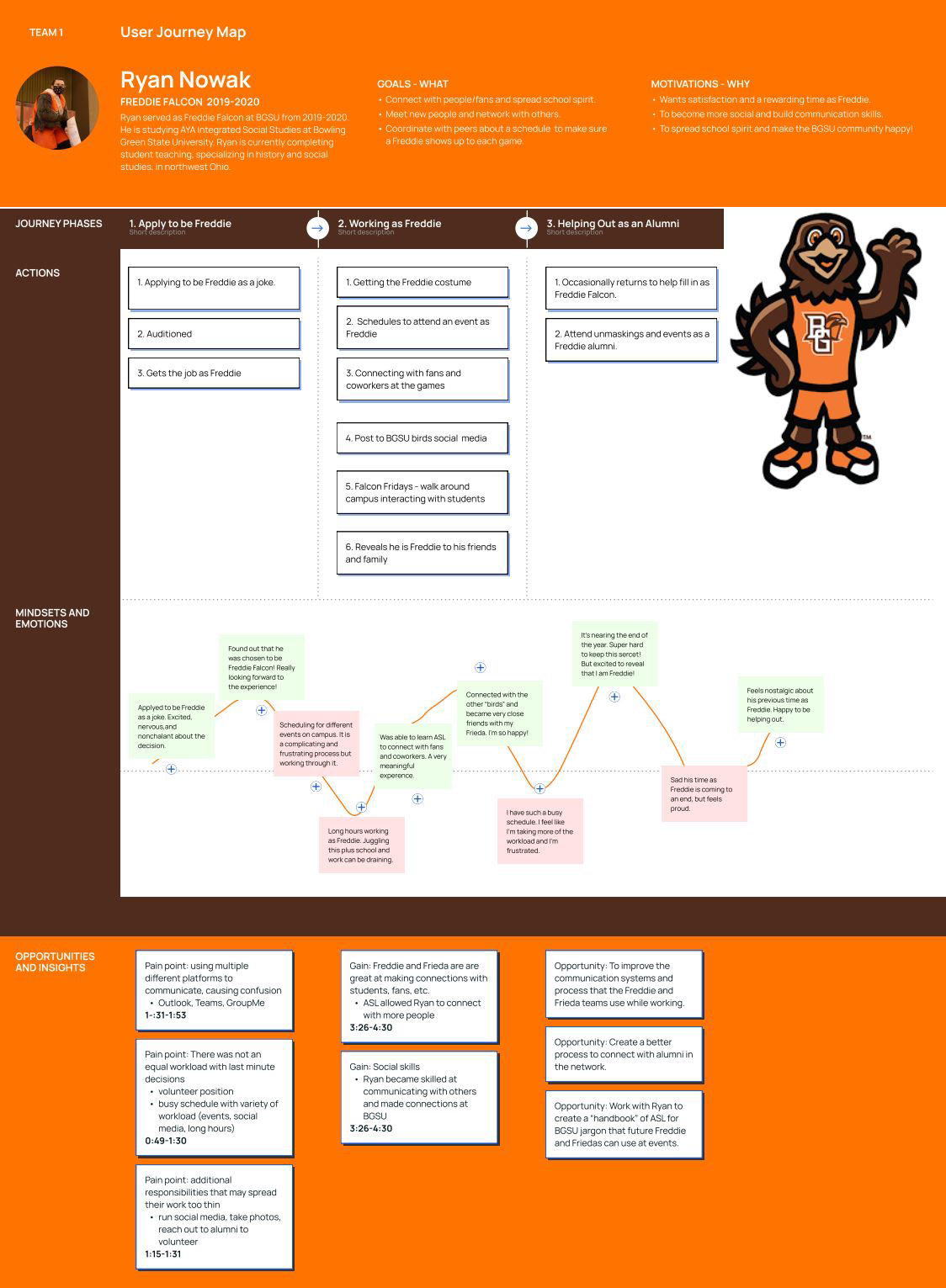
We used a Figma template to create a journey map with his persona to demonstrate the information we collected.
Step 3: Ideation
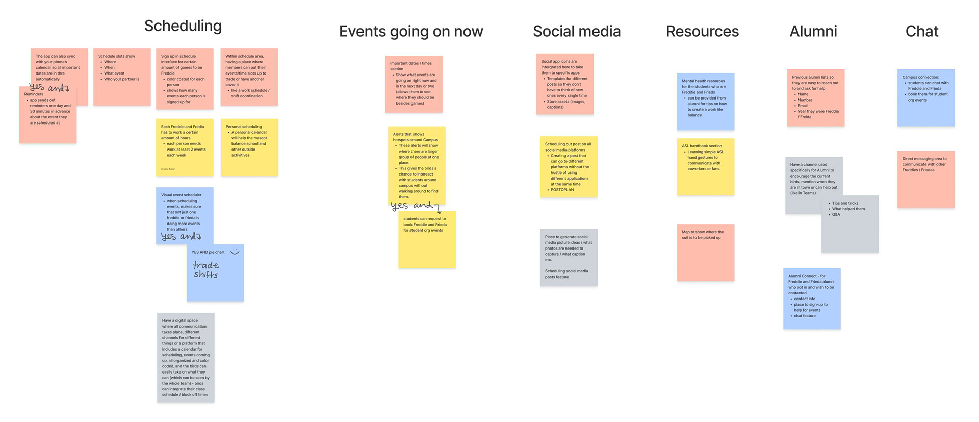
We came up with feature ideas for a mobile app to help the students working as Freddie and Frieda.
Step 4: Prototype
Using Figma, my team and I created the prototype synchronously. We focused on four user tasks that would later be tested by other classmates.
App Description
Bird’s Eye View is an app created for students at BGSU who are working as Freddie and Frieda. The app serves as a hub that combines everyone’s work schedule, events that they need to attend as Freddie and Frieda, a way to chat with other team members, and other resources such as connecting with those who have worked as the mascots in the past, social media tips, learning basic American Sign Language, and mental health coping skills.
App Justification
The purpose of this app is to create a place where communication, scheduling, and helpful resources can all take place. This app is created to take stress off the birds and provide more of a simplified and helpful resource for their mascot experience. It would potentially allow the birds to see each other’s schedule and sign up or trade shifts as needed to ensure that the work is divided among the birds fairly, as much as possible since this is one main goal that was discovered by interviewing a past mascot, Ryan Nowak. This app would allow the mascots to be more organized, better aware of events and scheduling, and better equipped to accomplish the goals of Freddie and Frieda.
Step 5: Usability Testing
My team and I conducted our own test 1:1 with other classmates.
I started the test by introducing myself and explaining the purpose of the test. I described the app and asked the user to think aloud as completing the tasks. I then stated the first task, took notes, and repeated this process until the test was completed. I then thanked the user for participating in the test and I met with my team members to discuss our findings.
I conducted four tests.
Tasks
1. Trade shifts with another team member to be the mascot, Freddie Falcon, at an event. For this task, imagine that you are BGSU’s Freddie Falcon. You want to pick up a shift as Freddie Falcon from your fellow team member. Trade shifts with another person.
2. Find out what time the volleyball game is tomorrow. For this task, imagine you want to attend a BGSU event tomorrow as Freddie. Find out what time the volleyball game is tomorrow.
3. Talk with another team member. For this task, imagine you are Freddie trying to get in touch with a fellow Bird team member about tonight’s event. Start a conversation with a team member.
4. Find the email address of a previous BGSU Freddie Falcon alumnus, Bryce Smith. For this task, imagine you want to connect with someone who has been Freddie in the past. Find the email address of a previous BGSU Freddie Falcon alumnus, Bryce Smith.
Notes
(If the user completed the task without any confusion, I wrote "correct").
Round 1
Task 1: User clicks on chat first then schedule, then clicks other areas before getting to the destination
Task 2: correct (the question said volleyball game at first, so it was confusing when it wasn’t there, switched to using hockey game instead).
Task 3: correct
Task 4: correct
Task 1: User clicks on chat first then schedule, then clicks other areas before getting to the destination
Task 2: correct (the question said volleyball game at first, so it was confusing when it wasn’t there, switched to using hockey game instead).
Task 3: correct
Task 4: correct
Round 2
Task 1: correct
Task 2: correct - but confused thinking there is more (clicks on it).
Task 3: correct
Task 4: correct
Round 3
Task 1: User clicks on schedule, then my schedule, then clicks on days, then full schedule, then team data, clicks on shifts. Doesn’t see the trade shifts area so the user goes to events, then chat - (I hinted that it’s in schedule, user goes to schedule and clicks on names).
Task 1: correct
Task 2: correct - but confused thinking there is more (clicks on it).
Task 3: correct
Task 4: correct
Round 3
Task 1: User clicks on schedule, then my schedule, then clicks on days, then full schedule, then team data, clicks on shifts. Doesn’t see the trade shifts area so the user goes to events, then chat - (I hinted that it’s in schedule, user goes to schedule and clicks on names).
Note: the trade shifts area was not showing on the phone because of the phone size difference.
- changed “team data” to “requests” with calendar icon-
Task 2: correct
Task 3: correct
Task 4: correct
Round 4
Task 1: correct but looking for word “shift”
Task 2: correct
Task 3: correct
Task 4: correct - but mentioned that she hadn’t looked in there yet
Task 2: correct
Task 3: correct
Task 4: correct
Round 4
Task 1: correct but looking for word “shift”
Task 2: correct
Task 3: correct
Task 4: correct - but mentioned that she hadn’t looked in there yet
Changes and Effectiveness
I realized after the first round that there was no “volleyball” game in the events, so I changed the question to ask the user to find out the time for the hockey game instead. This created less confusion.
I also discovered that there was a size difference of the phone size the prototype was created for and the phone size that the user was using, so the area of the team data where the user can trade shifts was not showing up. I made sure to tell the user that they reached the destination, and the phone size was the issue here, so they were confident that they completed the task.
My team members decided to change “team data” to “requests” with a calendar icon to see if this would help users feel confident that this would be the area to trade shifts.
However, I feel that the name should be clearer, such as “trade shift” and to have the team data in a different location. During round four, the user mentioned that she was looking for the word “shift” to complete the task, so this confirms my thought of changing the name to include the word “shift.”
Reflection
This testing process allowed me to learn about the different thought processes of different users. For example, when I asked a user to trade shifts with another team member, her first instinct was to use the chat feature to speak to the team member directly rather than going into the schedule area to find the feature that allows team members to trade shifts digitally. This testing process also allowed my team to discover our most confusing task flow, which is the trade shifts task, and we learned that the scheduling area is also cluttered and confusing to users.
Additionally, this testing process allowed me to act as a user for apps from other teams in our class and while this was valuable to the designers, it was valuable to me as well, since I could learn how other teams designed features. I learned a simpler way to design the feature for trading shifts and how the placement of this feature is best on the same page as the schedule, so it isn’t hidden. The title of this feature was also very clear, so I knew where to go in the app to trade shifts.
Additionally, this testing process allowed me to act as a user for apps from other teams in our class and while this was valuable to the designers, it was valuable to me as well, since I could learn how other teams designed features. I learned a simpler way to design the feature for trading shifts and how the placement of this feature is best on the same page as the schedule, so it isn’t hidden. The title of this feature was also very clear, so I knew where to go in the app to trade shifts.
Finally, I found that it was helpful to give a scenario for each task so the user could understand why he or she was doing it and it gave them context for the task. I feel that it gave the user a chance to be in the shoes of the mascots who would be using the app.